Project
Queerlet
Presented in Qtopia Nijmegen Queer Art Festival
a Queerlet in use
Project Queerlet is proposal for participatory toilet signage that enables users to create their own toilet sign by symbolizing how they identify, and a speculative bathroom that deconstructs and reconstructs itself based on those hand-drawn signs. Queerlets, the empty templates of bathroom signs, functioned as a probe for visual research on people's gender representation and symbolization by collecting an extensive amount of gender symbols drawn by people from various backgrounds.
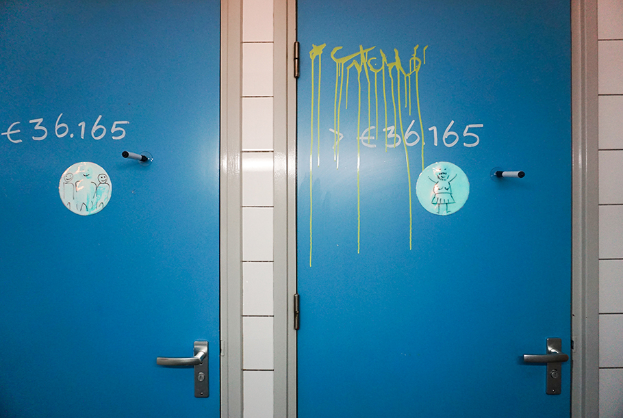
Queerlets installed on the public bathroom doors
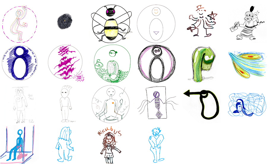
The aim of this part of the project is to create a database of highly-personal non-binary symbols of gender identity that can hopefully deconstruct and overthrow the obviousness of binary gender symbols.
The project furthered the demonstration of how toilet signage and (oftentimes) binary distinction that it creates relates to the built environment of a bathroom. What would be the environment of the non-binary toilets that are defined by the drawing on Queerlets? It resulted in an algorithm that draws floor plans of fictional bathrooms based on the drawings collected during the project using Queerlets. To generate floor plans, the algorithm digitally analyzes the drawings obtains parameters of “public/private, visible/invisible, decent/obscene, man/woman, penis/vagina, standing up/sitting, occupied/busy” that Paul B. Preciado proposed in his article “TRASHGENDER: URINATE/DEFECATE, MASCULINE/FEMININE”. The participants of the workshop could use this program to materialize their gender symbols into bathroom environments. Most of the time, the bathrooms that are generated look very absurd. By conflicting with the stereotypical toilet environment, which is a product of gender binarism, it opens space for viewers to raise questions about the toilet in their daily lives.
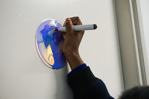
Queerlets were presented during Qtopia Queer Art Festival Nijmegen 2019. Fifty pieces of Queerlet was installed on every toilet door in the exhibition venues. The aim of this part of the project is to create a database of highly-personal non-binary symbols of gender identity that can hopefully deconstruct and overthrow the obviousness of binary gender symbols. To enlarge the collection, I facilitated a few drawing workshops in several different contexts, including Queer Bookclub at Van Abbe museum. People were asked to draw their own gender symbols, and they could feed their creation into the digital algorithm that I created.
The following is an excerpt from an interview with Depatriarchise Design
Noam: The project that you mentioned is called Queerlet – like: queer toilet. It started from the simple observation that gender-neutral toilets are now present in more and more places (especially cultural institutions), but the sign language that they use is still very much based on the binary idea of gender. Some for example use a combination of a typical male symbol and a typical female symbol. I started thinking about a queer alternative to that.
depatriarchise design: Often the actual really gender-neutral toilet is the one for people with disabilities, which is also problematic because it suggests that in this case, the gender of the user (who is depicted in a wheelchair) doesn’t play a role at all.
Noam: Yes, there is a de-sexualization of disabled people. They’re not treated as sexual subjects. Also, only a small percentage of disabled people use a wheelchair, but the design with a person in a wheelchair is meant to represent the entire disabled population. There is a project called Visability93 with visually interesting signs that represent each disability, indicating very specific differences.
dd: How do you understand the word “queer” in the title of Queerlet?
Noam: I see “queer” as both a noun, an adjective, and a verb. However, I find it difficult to define, even though I identify as a queer person.
dd: Especially since queer in its essence is against having clear or universal definitions.
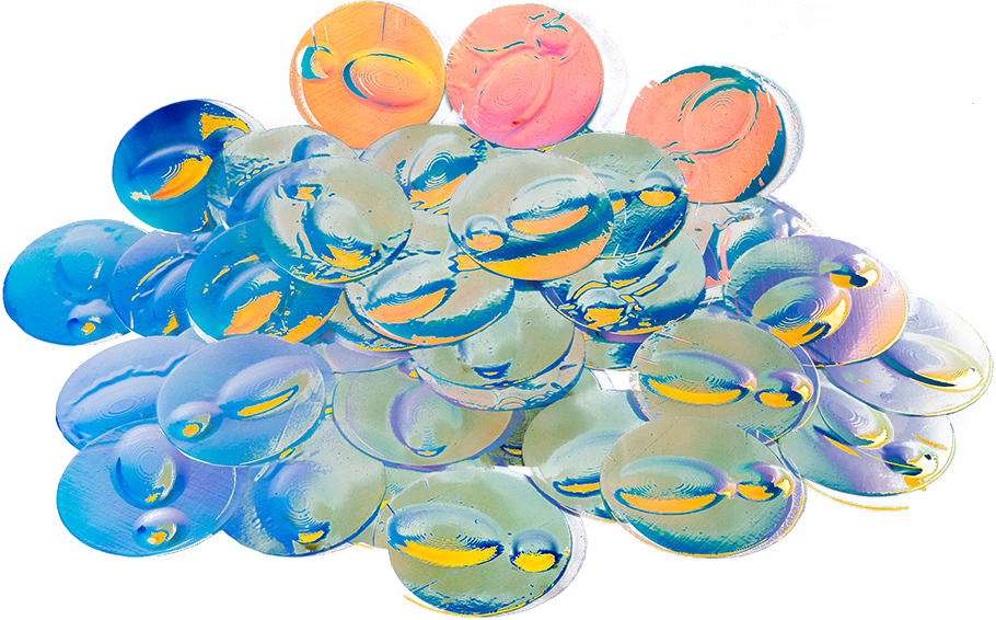
Noam: Exactly. I think it’s important to remember that it is a poly-vocal adjective. When it comes to the queer toilet sign, I didn’t want to dictate: “This is a queer toilet sign”. So, I chose to make an empty template for people to just share whatever idea they want. I was curious to see the outcome. My design choices were really minimal and open: The sign itself has a subtle silhouette that indicates a human. It isn’t white or black or grey but coated with holographic film so that it looks different depending on the angle it is seen from. I understand it like a probe that collects the symbolic representation of queer people’s gender identities. Once I had this template, I brought it to many different public toilets in Eindhoven (in the Netherlands): from a queer party hosted by the organisation Day Day Gay to any kind of restaurant in the city. This was also extensively used during Qtopia Queer Art Festival in Nijmegen. 50 pieces of Queerlet were installed on every toilet door in the exhibition venues; Queerlet functioned as a part of the festival’s identity, as well as a video installation exhibited at NEUS gallery.
dd: How did people react?
Noam: It was very – unidentifiable. I could not discover any kind of particular tendency or differences between what straight and what queer people tend to draw. But I find this undefined outcome very pleasurable.
dd: Have you been there while people were drawing?
Noam: In most cases, I was somewhere else, and could not associate the drawings with their creators. I could only witness the drawings while they were being made when I brought queerlets to a few public drawing workshops. Actually, those workshops really helped me to diversify the demographics of the audience, from my classmates to elderly people that vaguely understand the concept of being queer. But even they found it very interesting to define and symbolise how they see their gender identity. I think the most interesting drawings came from people that I didn’t expect to surprise me. For instance, there was a symbolic drawing made by an elderly man that had a very colourful, sort of phallic shape at the centre and two balls. I believe it was a representation of his straight male gender identity, but the representation of it was so aesthetically pleasing and also way more interesting than a stick figure standing. While some drawings were relatively explicit about what they signified, others were very ambiguous and nuanced. In total, I collected about 30 to 40 pictures. I’m interested in expanding that collection into a database of queer symbolic representation, it’s just a matter of time and resources.
dd: What was the next step of the project?
Noam: I was speculating on what I could do with the outcome. There is an article that really influenced me, called “Trashgender: Urinate/Defecate, Masculine/Feminine” by Paul B. Preciado, published in The Funambulist 13 (September–October 2017) Queers, Feminists and Interiors. The article critically investigated how the interior environment of toilets is determined by the binary way in which we are labelling it. Preciado proposes a framework that can help to grasp this binary: public or private, visible or invisible, decent or obscene, man or woman, penis or vagina, standing up or sitting down, occupied or empty. The binary framing of the toilet does not only define the genitalia of the users, but also the environment of it. I asked myself if these binary distinctions of the toilets are formed by the binary signs, and I began speculating about the question: What could be behind the queer toilet signs that my audience created?
dd: Like: How does the respective sign change the interior space behind that door?
Noam: I set the binary parameters proposed by Preciado in his article and assigned them numerical values of either 0 or 1, and reframed that binary system into a spectrum that can also include “ambiguous” numbers like 0.5 or 0.6. Based on this, I created a digital software (which works like this) and then analysed the drawings that I had collected, using a simple computer algorithm on just a few scripts of code, asking for example: Is the image assumingly representing a person who is standing up or sitting down? In each case, with the help of the results, a computer program automatically created a floor plan of the toilet. For instance, the parameter for decent/obscene determines how luxurious the toilet pieces are. The logic is very absurd, but nevertheless, the logic that has been determining our toilet designs so far is pretty absurd too, maybe even more absurd than this interpretation. So, I think the absurdity of it is justifiable.